

![[Translate to English:] van achter verlichte led letter wit](/fileadmin/_processed_/d/4/csm_thumb_dd928ef84293ec9af3a40d9550543b76_02_474b7b48d1.jpg "[Translate to English:] van achter verlichte led letter wit")
![[Translate to English:] van achter verlichte led letter blauw](/fileadmin/_processed_/2/7/csm_thumb_918cf4f642e0f123119adb27d495a73f_02_3baf92bdbf.jpg "[Translate to English:] van achter verlichte led letter blauw")
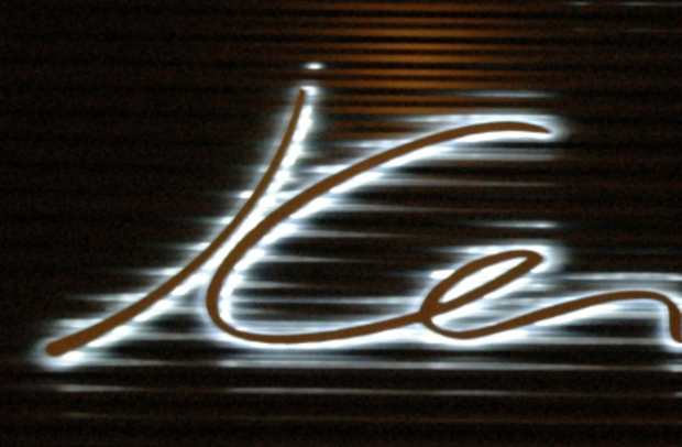
[Translate to English:] Backlight signage en lightcolor
Because the light is reflected trough the background, keep in mind that a dark background-color reflects the light a lot less opposite to a light background.
As the LED-colour will change the view of the signs. White reflects the best and gives the most contrast, while blue gives the worst contrast. You also have to watch out with green and red LEDs. Amber is the best choice after white...
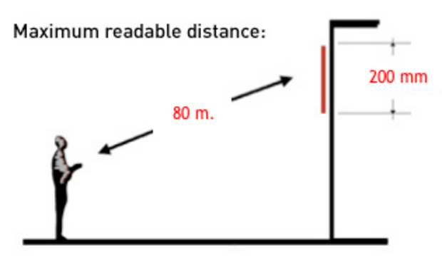
Readable distance
A ground rule for readable distances is Letter-Height (cm) x 4 meters. So a Letter of 10 cm can be read at 40 meters of distance. A letter of 100cm is readable upon 400 meters.
This is just a basic rule. Some fonts, colours and sizes are better to read and some are worse to read. For example: a blue sign will look as one big blue spot at a large distance where a white sign is reasonable readable at the maximum readable distance.
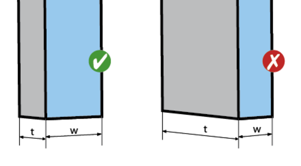
Thick or thin signage
Most producers of Light Signs can produce nice thick aluminium signs. These look good from a distance and with use of thick fonts. But what if your font is thin and what if you have small signs? With these kind of signs you can't use thick signs because they are not readable at closer distances and you can't read them from aside, the sign/word will 'closen-up' and you will only see the sides.
Our ground rule; if the thickness (t) of a sign is greater than the width (w) of the sign, then you better choose a thin sign, like Complilight or Frontlight.